Overview
Problem
Fathers want to get more connected with other fathers, to share their joyous, social, emotional, and difficult times, in addition to helpful information.
Need to identify key ways to improve the attraction of more of this user base to Client’s webpages and social media accounts.
Research-Backed Findings/Suggestions
Add a carousel on the top of Home page, to give viewers glimpses of the content/products/events Client is/will be providing to members/viewers.
Add more webpages (Podcast, Community, and Contact Us), each of which would contain more information about the services and content Client would provide to members/viewers.
Add icons and links for Client’s social media accounts, onto the nav bar.
Add more content to Client’s About Us page, so members/viewers have a well-rounded idea as to what Client both currently, and will offer.
The explanations for each of the above suggestions can be found at the bottom of the page (UX Research Summary).
Stakeholders
2 Co-Founders/C-Suite
My Roles
UX Researcher
Interviewer
My Roles
Adobe XD
PowerPoint
Note: Within the rest of this page, I will use “Client” to refer to Dads Are Cool Too!.
Conclusion of UX Research
For Client - Dads Are Cool Too!
UX Research Summary
Key Highlights From UX Research
Interviewed participants mainly (and incorrectly) thought that Client was solely an apparel company, because the only content they noticed on the Home page was apparel. Because of that, they also didn’t realize that Client wanted to either create a father community, or be engaged with their members/viewers.
Research-Backed Findings/Suggestions, based on the competitor analysis, and participant interviews:
Add a carousel on the top of Home page, to give viewers glimpses of the content/products/events Client is/will be providing to members/viewers.
Add more webpages (Podcast, Community, and Contact Us), each of which would contain more information about the services and content Client would provide to members/viewers.
Add icons and links for Client’s social media accounts, onto the nav bar.
Add more content to Client’s About Us page, so members/viewers have a well-rounded idea as to what Client both currently, and will offer.
UX Project Process
UX Research
An entire UX project contains both research and design, each of which has two sub-phases.
The research content mostly consists of components in the research and define phases, whereas the design phase consists of the design and test phases.
Note: This deliverable was created with Adobe XD.
Research
Research Goals | Competitive Analysis/Insight | Interviews | Interview Analysis/Insight
Research Goals
Gather Key Findings Of How Client Stands With Its Competition –
What keeps Client ahead of its competitors, and more importantly,
What the Client is lacking, in order to identify opportunities for them to improve, expand, and grow.
Understand Wants And Needs Of Client's Audience –
Uncover participants’ pleasures of Client’s current website, and
Identify key pain points shared by participants as they view Client's pre-existing webpages.
Competitive Analysis
To understand how Client stands with competitors, I gathered desktop data from both Client and four of Client's competitors.
The importance of competitive analysis is to see content/design that Client either has (or doesn't have) in relation to Client's competitors.
Key Insight
Below are the most important key insights gathered from the competitive analysis of the four competitors’ websites.
This helps get a better idea of what kinds of interview questions to ask interview participants, in order to gain more understanding of how participants both positively and negatively perceive Client's designs.
Note: This deliverable was created using Figma.
Interviews
After analyzing the results of how Client compares with the four competitors, I searched for applicable participants who fit the Client’s persona.
Note: This deliverable was created with Adobe XD.
Key Insight
Below are the key insights found, from the analysis of the interviews.
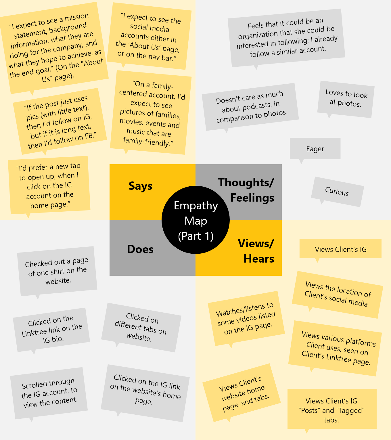
The most important insights from these interviews are also mentioned in the empathy map in the define phase.
2. Define
Persona | Empathy Map | Sitemap | Task Flow | User Flow
Persona
After assessing and analyzing the research findings, I created a primary persona, to define a realistic customer and user of Dads Are Cool Too!'s products, features, and community.
Empathy Map
After analyzing the responses, actions, thoughts, and feelings from participants in the research study revolving around Client's desktop and mobile application, I put together an empathy map, which highlights the greatest and most impactful findings, from:
Says: What participants say about their experience while viewing Client's website/application(s).
Does: What participants do on the website/application(s).
Thoughts/Feelings: How participants think/feel about certain pages/content/navigation.
Views/Hears: What participants see/hear in different types of content.
Pains: How participants experience different pains/difficulties, while using the website/application(s).
Gains: When participants experience a fruitful/positive end goal.
The empathy map helped to gage what main concepts to keep in mind, prior to starting to sketch out the redesigns of the web pages.
Retrospective
Challenges
There was a lot of data which needed to be gathered, because Client’s original webpages were missing out on a lot of valuable web space. The Client was not displaying all of the main goals that they desired to provide to potential consumers/members.
Because of that, it was a big task to fully understand the attributes that Client has that were identical with its competitors, in addition to what it is missing.
And the corresponding thoughts of participants were equally crucial, in order to understand the key channels on which Client is missing out, and ways in which it can unveil the information to consumers.
Next Steps
What’s next?
I used this research data, to proceed to the design phase:
I worked on adding applicable new pages, redesigning mid-fi wireframes, and prototypes.
The redesign was all based on both the knowledge created/produced during the research phase, in addition to continued usability testing.
Check out more projects
Thank you!
for being engaged!
Feel free to connect with me, if you either want to learn more about my background/experience, or have any opportunities for me!


