

Overview
In my previously executed UX Research Project for Dads Are Cool Too!, I gathered insight through competitive analysis and usability testing, to identify big-picture steps to take on the webpages, in order to meet stakeholders’ goals to increase recurring traffic, and gain more members/viewers.
Now, in the UXD - Dads Are Cool Too! design project, I had numerous goals, still centered in the end goal of improving user experience. This will be done by redesigning pre-existing webpages, in addition to creating more webpages, which will make the front end:
easily navigable in order to please users,
aesthetically pleasing in order to attract new users, and
providing all of the necessary insight to both current and future customers/members, to ensure that Client has a user base that is completely relevant to what Client wants to deliver to users.
Stakeholders
2 Co-Founders
My Roles
UX Designer
UI Designer
My Roles
Adobe XD
Adobe Illustrator
Note: Within the rest of this page, I will use “Client” to refer to Dads Are Cool Too!.
Final Product
Please see below for the final prototypes (desktop and mobile).
Note: To identify which parts of the page are clickable, go ahead and click anywhere on the page. The clickable areas will immediately light up after each click.
UX Research Recap
[Already provided at the end of the UXR page, but just recapping the summary of UXR]
Based on the data and insight that I gathered during my research phase, I had a clear idea of how to create redesigned pages, in addition to brand new pages.
Interview participants mainly (and incorrectly) thought that Client was solely an apparel company, because the only content they noticed on the Home page was apparel. Because of that, they also didn’t realize that Client wanted to either create a father community, or be engaged with their members/viewers.
Research-Backed Findings/Suggestions, based on the competitor analysis, and participant interviews:
Add a carousel on the top of Home page, to give viewers glimpses of the content/products/events Client is/will be providing to members/viewers.
Add more webpages (Podcast, Community, and Contact Us), each of which would contain more information about the services and content Client would provide to members/viewers.
Add icons and links for Client’s social media accounts, onto the nav bar.
Add more content to Client’s About Us page, so members/viewers have a well-rounded idea as to what Client both currently, and will offer.
UX Design Process
UX Design

An entire UX project contains both research and design, each of which has two sub-phases.
The research content mostly consists of components in the research and define phases, whereas the design phase consists of the design and test phases.
Note: This deliverable was created with Adobe XD.
UX Design Goals
Improve UX/UI, To Best Cater To The Audience/Users –
Provide redesigned prototypes and UI Kits for the desktop and mobile web pages.
Add/subtract appropriate content and pages, to keep Client in the forefront of the market.
When rolled out, will both retain and acquire customers, to ultimately improve sales, and increase ROI.
3. Design
Mid-Fi Wireframes | UI Kit | Brand/Styling Revisions | Hi-Fi Wireframes
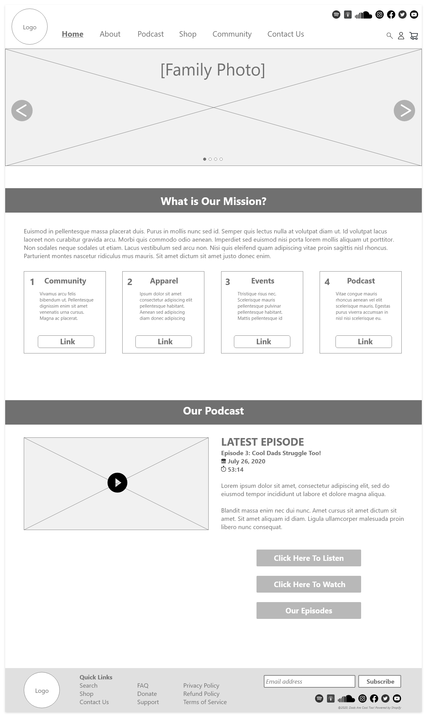
The most important insight that I gathered, and want to share in my portfolio, was redesigning the Home page, and adding two pages (Community page, and Our Podcast page).
Note: If you’d like to see the redesigns for the other pages, you can find them within the desktop and mobile prototypes at the bottom of the page.
All interviewed participants in my research phase originally thought that Client was just an apparel company. When I shared with the interviewed participants that Client has other channels (social media accounts, and in-person events), the interview participants voiced that it would be helpful to add more of that content in relevant pages, include the content in individual web pages.
I added more identifiable content in the Home page, to:
Convey the mission that Client holds, in addition to
The most recently aired podcast.
I also added two pages, to better identify everything that Client offers to potential (and current) viewers:
Community page, and
Our Podcast page.
Lastly, since interview participants didn’t know that Client had social media applications, I added linked social media images in the nav bar, in addition to the About page and Community page.
Mid-Fi Wireframes
Desktop
While continuing to keep in touch with the original interview participants whom I interviewed in the research phase, I had provided them with the mid-fi wireframes. They mentioned that there should be three podcast episodes for each row on the Our Podcast page, so I made that adjustment in the prototype version of the redesigns.
The below mid-fi wireframes are redesigned Home page, and newly created Community, and Our Podcast pages.
Note: This deliverable was created with Adobe XD.
Redesigned Pre-Existing Pages
Home Page
Newly Added Pages
Our Podcast Page
Community Page


Mid-Fi Wireframes
Mobile
After completing the desktop mid-fi wireframes, I converted them to mobile pages.
I converted most of the links of the nav bar into a hamburger dropdown. And in order to maximize the use of the space on the web pages, I converted the text into collapsed text, which caused the scrolling through the sections to be faster and more seamless.
The below mid-fi wireframes are redesigned Home page, and newly created Community, and Our Podcast pages.
Note: This deliverable was created with Adobe XD.
Home Page

Newly Added Pages
Community Page

Our Podcast Page

Branding and Styling Revisions
It is important to compare the changes to the pre-existing designs, to enable Client to better understand the redesigned pages.
Note: This deliverable was created with Adobe XD.

UI Kit
To keep the future revisions consistent with pre-determined content, colors, icons, forms, and typography, it's best to create a UI Kit.
Note: This deliverable was created with Adobe XD.

Hi-Fi Wireframes
Desktop
As mentioned in the desktop mid-fi wireframes overview, I originally had two podcast episodes on each row, but based on my usability research, I changed the Our Podcast page to have three podcast episodes in each row in the hi-fi wireframes.
Please see below for the desktop hi-fi wireframes for Home page, and redesigned pages for Community and Our Podcast.
Note: This deliverable was created with Adobe XD.
Redesigned Pre-Existing Pages
Home Page

Newly Added Pages
Community Page

Our Podcast Page

Hi-Fi Wireframes
Mobile
After completing the redesigned/new designed desktop pages, I converted them to mobile pages.
I made the same conversions that I did in the mid-fi wireframes: I converted most of the links of the nav bar into a hamburger dropdown. And in order to maximize the use of the space on the web pages, I converted the text into collapsed text, which caused the scrolling through the sections to be faster and more seamless.
Note: This deliverable was created with Adobe XD.
Redesigned Pre-Existing Page
Home Page

Newly Added Pages
Community Page

Our Podcast Page

4. Test
Usability Testing | Final Product
Upon completion of the desktop and mobile prototypes, it is important to ask the participants to test out the two prototypes, which would enable them to weigh in on how much the prototypes satisfy their wants and expectations.
Usability Testing
Usability Testing Goals –
Whether the redesigns of the prototype enable the participants to better understand Client’s mission and goals.
Hear participants’ feelings about the ease of use/navigation of the nav bar and web pages.


Subject –
Desktop and mobile prototype of the redesign of Client’s website, in Adobe XD.
Participants –
Four of the original five interviewed participants in the research phase.
Tasks For Participants –
I asked each of the participants to navigate through the prototype, and also asked for them to provide their thoughts of the content and appearance of the redesigned prototype pages, and if the redesign gave more understanding of the features, products, and community the company was offering to the end user/viewer.
Findings From Usability Testing –
All participants were very impressed with all of my redesigned work. The only suggested modifications were very minor –
1. Get rid of the spacing between the review posts in the Reviews box.
2. Have headers of Our Mission Overview to just have one word, instead of sentences; that would make it easier for users to view, scan, and read.
Minor Updates for the Prototype –
I understood and agreed with the participants' suggestions, so I modified the prototype to accommodate these changes.
Conclusion of UX Design
For Client - Dads Are Cool Too!
Retrospective
The redesigned desktop and mobile web pages reached goals set at the beginning of the UX/UI Project (business model from stakeholders).
Throughout the project, the participants voiced helpful thoughts about their perception of Client's web pages at that time, which led us to many ideas in terms of types of content to add/modify, ways to redesign the current pages, and lastly, identifying the necessity and types of new webpages to create.
Challenges
It took time to determine how to design the two new pages (Community page, and Podcast page). It demanded a lot of effort, in both reviewing competitors’ similar pages, in addition to hearing thoughts, preferences, and experiences from participants.
Similarly, it was very important and time consuming, to determine the type of content for the redesigned Home page; the Home page is almost always the first thing that all new users see. Since participants were misled about the drive/mission of Client, due to the limited amount of content on the Home page, it was very important to determine the new content to add to the page.
Final Outlook
By the end of this project, I was able to provide great redesigns, and awesome new pages, from my in-depth competitive research and interviews with participants.
The participants' positive reception of the prototype confirmed that the desktop and mobile versions of the redesigns were the best path that Client could possibly take.
Once Client takes action on their current web pages using these prototypes, UI Kit, and redesign, I am very honest in saying that they will end up with more consumers/viewers, a bigger community, and a higher ROI.
Check out more projects


Thank you!
for being engaged!
Feel free to connect with me, if you either want to learn more about my background/experience, or have any opportunities for me!