

Overview
Since this was a case study for Apple TV, I wasn’t working directly with them. However, it was a perfect case study, because the design of this application definitely needed rework, due to most of the reviews that I had read online.
I achieved a solid framework of redesigns due to the data I got from the UX Apple TV Research Project that I performed for this application. From that work, I had a solid foundation that enabled me to be comfortable to work on the redesigned pages.
Stakeholders
N/A; just a case study
My Roles
UX Designer
UI Designer
My Roles
Adobe XD
Adobe Illustrator
Note: Within the rest of this page, I will use “Client” to refer to Apple TV (even though they aren’t officially my client, since this was a case study).
Final Product
Please see below for the final prototypes (desktop and mobile).
Note: To identify which parts of the page are clickable, go ahead and click anywhere on the page. The clickable areas will immediately light up after each click.
UX Design Process
UX Design

An entire UX project contains both research and design, each of which has two different phases.
The research content mostly consists of components in the research and define phases, whereas the design phase consists of the design and test phases.
Note: This deliverable was created with Adobe XD.
UX Research Recap
[Already provided at the end of the UXR page, but just recapping the summary of UXR]
Based on the data and insight that I gathered during my research phase, I had a clear idea of how to create redesigned pages, in addition to brand new pages.
Key Highlights From UX Research
·Create a button in the right-hand side of the screen, for the sign-in link.
Explanation: Interviewed participants found it difficult to find the sign-in link on the desktop version (was on the left-hand side of the nav bar, through a dropdown).
Add a Seasons dropdown for each TV show.
Explanation: Interviewed participants wanted the different seasons for TV shows to be split into sections in a dropdown (during this UX Project, Apple TV had "Season 1" listed at the top of the page, even though it was displaying all of the series for The Office. Plus, even more confusing, was that all of the seasons were being displayed in sequential order on that one page).
Add a high-level overview of each episode, right next to the corresponding episode.
Explanation: Interviewed participants wanted to either know the premise of each episode before viewing, or a reminder of the premise of each episode, if they were searching for an episode that they had already streamed.
Make the media viewing page on the same page/window as the original Apple TV (iTunes) page.
Explanation: Interview participants expected the streamed episode to still be displayed on the Apple TV desktop app, but just on a different page (instead of popping up a whole new box/window).
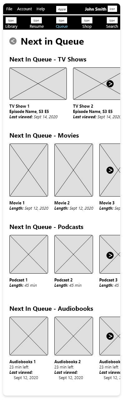
Create Next in Queue page.
Explanation: Interview participants mentioned that since they often like to watch a TV show from the first episode until the last one, they enjoy being notified about the episodes that are next in queue, once they finish each episode.
Create Resume page.
Explanation: Interview participants wanted a page to exclusively display each of the individual media content that they hadn't finished viewing.
3. Design
Mid-Fi Wireframes | UI Kit | Brand/Styling Revisions | Hi-Fi Wireframes
As mentioned in the UX Research summary, interview participants were seeking new pages (Resume, and Next In Queue). Although I have all of the redesigned pages in the desktop and mobile prototypes at the bottom of this page, I will highlight the most profound newly designed/redesigned pages.
The newly designed pages are Resume, and Next In Queue, and the redesigned pages are TV Shows, and TV Show Details.
Note: If you’d like to see the redesigns for their other pages, you can find them within the prototypes at the bottom of the page.
Mid-Fi Wireframes
Desktop
Please see below for the desktop mid-fi wireframes for the redesigned pre-existing pages of TV Shows, TV Show Detail, and the new pages for Resume, and Next In Queue.
Note: This deliverable was created with Adobe XD.
Redesigned Pre-Existing Pages
TV Show Detail Page
TV Shows Page


Newly Added Pages
Next In Queue Page
Resume Page


Mid-Fi Wireframes
Mobile
Please see below for the mobile mid-fi wireframes for the redesigned pre-existing pages of Library, TV Shows, TV Show Detail, and the new pages for Resume, and Next In Queue.
Note: This deliverable was created with Adobe XD.
Redesigned Pre-Existing Pages
Library Page

TV Shows Page

TV Show Detail Page

Newly Added Pages
Resume Page

Next In Queue Page
Branding and Styling Revisions
It is important to compare the changes to the pre-existing designs, to enable Client to better understand the redesigned pages.
Note: This deliverable was created with Adobe XD.

UI Kit
To keep the future revisions consistent with pre-determined content, colors, icons, forms, and typography, it's best to create a UI Kit.
Note: This deliverable was created with Adobe XD.

Hi-Fi Wireframes
Desktop
Please see below for the desktop hi-fi wireframes for the redesigned pre-existing pages of TV Shows, TV Show Detail, and the new pages for Resume, and Next In Queue.
Note: This deliverable was created with Adobe XD.
Redesigned Pre-Existing Pages
TV Show Detail Page
TV Shows Page


Newly Added Pages
Resume Page

Next In Queue Page

Hi-Fi Wireframes
Mobile
Please see below for the mobile hi-fi wireframes for the redesigned pre-existing pages of Library, TV Shows, TV Show Detail, and the new pages for Resume, and Next In Queue.
Note: This deliverable was created with Adobe XD.
Redesigned Pre-Existing Pages
Library Page

TV Shows Page

TV Show Detail Page

Newly Added Pages
Resume Page

Next In Queue Page

4. Test
Usability Testing | Final Product
Upon completion of the desktop and mobile prototypes, it is important to ask the participants to test out the two prototypes, which would enable them to weigh in on how much the prototypes satisfy their wants and expectations.
Usability Testing
Usability Testing Goals –
1. Understand participant's perception and thoughts of the redesigned application.
2. Hear and record the thoughts and recommendations for possible adjustments of the redesign.
3. Assess these suggestions to ascertain which updates should be addressed/performed.


Subject –
Desktop and mobile prototype of the redesign of Client's application, in Adobe XD.
Participants –
Four of the five participants in the research phase.
Tasks For Participants –
Participants were asked to review the mobile and desktop prototypes, and also asked to let me know the seamlessness of the navigation, especially when compared to Client's original application.
Findings From Usability Testing
The participants greeted both the desktop and mobile prototypes with much respect. All participants have mentioned that if Apple TV were to roll out this redesign to their product, the participants would be much more inclined to use this application, compared to how they feel about the current/original application.
I didn't receive any recommendations for the desktop version, but I received a recommendation for the mobile prototype; to only have one header with two rows, and no footer.
Minor Updates for the Prototype –
I understood and agreed with the participants' suggestion, so I updated the mobile prototype to satisfy that suggestion.
Conclusion of UX Design
For Client - Vesta Fitness
Retrospective
Since the beginning (even prior to the start of this case study), users of Apple TV were dissatisfied with the layout, design, and use of streaming TV Shows.
The redesigned desktop and mobile pages reached goals set at the beginning of the UX/UI Project (pre-deployment goals).
Throughout the project, the participants voiced helpful thoughts about their perception of Client's current pages, which led to many ideas in terms of types of content to add/modify, ways to redesign the current pages, and lastly, identifying the necessity and types of new pages to create.
Challenges
Although I had great concepts that were identified in the research phase, some of the project’s difficult parts were deciphering how to style the Library, and where/how to style/order the tabs on the nav bar.
In order to ensure that these designs satisfied users expectations, I had to perform iterative testing, in both the mid-fi wireframes and the redesigned pages. The final product that I produced deemed to be the best design that would satisfy user expectations.
Final Outlook
Although I have experience redesigning pages on desktop and mobile, it required just a little adjustment to redesign an application (on both desktop and mobile).
I am very confident in the redesign/prototype that I have created, and because of this, I feel confident in working on future UX research/design projects for employers’ webpages/applications.
Check out more projects


Thank you!
for being engaged!
Feel free to connect with me, if you either want to learn more about my background/experience, or have any opportunities for me!