


Overview
ConsumerTrack highlighted their business goal, based on their business problem. They told me that they were experiencing a large number of end users who backed out of the last page (Page C) of creating a credit score account on one of ConsumerTrack’s websites (GOFreeCredit.com).
The stakeholders asked me to identify two different concepts to redesign Page C (for both desktop and mobile) in order to improve user engagement on Page C. The overall goal was to have users complete their credit card number on Page C.
Stakeholders
4 Product Design Leads
My Roles
UX Researcher
UX Designer
Product Designer
My Tools
Figma
Microsoft Office Suite
Duration
20 hours
Product Design Process
What Phases Did I Use?

Because of the fast turnover expected for this project, I was limited with the number of UX Methods I could use. I do have future plans for next steps, outlined at the end of each of these phases.
Note: This deliverable was created with Microsoft Office Suite.
Research and Analyze
Competitor Research | Analysis | Future Research
As a Product Designer, I performed some competitive research and highlighted key insight, followed by analysis about how the insight compares with the current content and design of Page C.
After I finishes the methods, I then put together the research that I would have performed if I had more time and resources.
Competitor Research
Findings from 4 Competitors’ Home page:
Half of the competitors had spacing between sections of content (2., 3.).
Majority of the competitors requested for an account (email address) to be created (1., 3., 4.).
1.FreeScoreOnline

2. Equifax

3. TransUnion
4. FreeCreditScore

Analysis
I then worked on viewing, assessing, and analyzing the current design of Page C.
I have come up with the following findings from Page C:
Unsure of exact reason for the page, and some content (Apply, Verify, View).
Solution: Modify title of Page C.
Copy/content not directly addressing the end user.
Solution: Add “You” and/or “Your” to copy.
A lot of content in tight space.
Solution: Add more space in between sections of content.
Note: This deliverable was created with Figma and PowerPoint.


Future Research
I have identified more UXR methods to use, to continue to identify better designs that increase the likelihood of end users adding their credit card information, as the last step to creating an account for credit score.
Ways To Find New Key Opportunities:


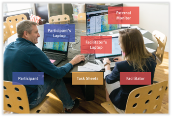
Usability Testing:
Have participants go through process in Pages A, B, and C, and understand if they would/wouldn’t provide their credit card number, and what are the reasons.
Assess all results, to know how to improve customer journey, to increase number of users entering their credit card number.
Identify persona:
Identify true understand the traits of the end users, to better find appropriate participants for usability testing.
Design and Test
Concept 1 | Concept 2 | Future Testing
Because of my findings during my analysis of Page C, I have devised two main concepts for two redesigned pages (each with a desktop and mobile).
I created these redesigned pages using two different concepts, and then put together plans for next steps I’d perform, if I had the available time and resources.
“This is a great presentation; thank you so much for your insight, and responses to our questions!”
Concept 1
Since the original name of Page C was “View”, as the users went through Pages A and B, the end user wasn’t sure of the purpose of the “View” page; they might have assumed that the “View” page would have given them access to their credit score.
I also saw an opportunity to improve engagement with the end user by making credit card information the first thing the user would see, so I changed the order of content on the page; credit card information became the first content on the page, and below it was account information.
I didn’t change/reword anything on the page except for the name of the page.
Overview:
Original Page C title (“View”) didn’t clearly prepare the user with the purpose of that page.
Solution: Changed page title to “Pay”.
Solution: Swapped the order of content on page (credit card information now on top).
Note: This deliverable was created with Figma.
Desktop

Mobile

Concept 2
It is very important to keep content addressed to the end user, so the user could be more engaged with the content. Additionally, to make the viewing easier on the eyes, spacing throughout the page is key.
Overview:
Welcoming overview must describe the beneficial outcome that the user will get once they complete the page.
Solution: Edit the copy of the welcome statement to engage with the user, and explain the benefits the user will get.
Need to put more focus on the user.
Solution: Directly address the user with every relevant piece of content/copy on the page.
Provide the user with more excitement on the page, to encourage them to complete CC number.
Solution: Add more copy (exclamations, and encouraging text), and icons.
Provide more space to create more breaks in between content, to make it easier for user to have a seamless journey.
Solution: Add spacing in between content.
Note: This deliverable was created with Figma.
Desktop

Mobile

Future Testing
I have methods I’d use if I had more time and resources. In order to see if Concept 1 or Concept 2 provides better concepts and designs that encourage user to give their credit card information.
I’d use both qualitative and quantitative methods.
Testing Goals:
Make sure Concepts 1 & 2 engage the participants, and end with them wanting to enter their CC number.

A/B and Usability Testing
Qualitative
From both Concept 1 and 2, ask participants if they could see themselves entering their CC number.
Understand reasons for why/why not.
Use this insight for modifications.

Quantitative
Once have two strong redesigned concepts, then either create:
Prototypes for UserTesting, or
Use back end developers to create the two different designs of Page C, and have it go live, and record data of ~100 users (randomly choosing which version of Page C to each user).
Final Outlook
I am very delighted to have worked with a very successful digital marketing and customer acquisition company. I helped them to identify the best ways to improve the engagement with the end user, to reach the goal of getting each user’s payment information via credit card, and complete the journey of a becoming a brand-new customer.
Thank you!
for being engaged!
Feel free to connect with me, if you either want to learn more about my background/experience, or have any opportunities for me!